Change is inevitable in this hyper-accelerated world, and you want to stay ahead of it. You want to be at the forefront of a conversation. A firm’s identity must keep up, leading that change. This article is a story about how a brand reset can help your company convey a feeling of vibrancy and creative energy to your audience.
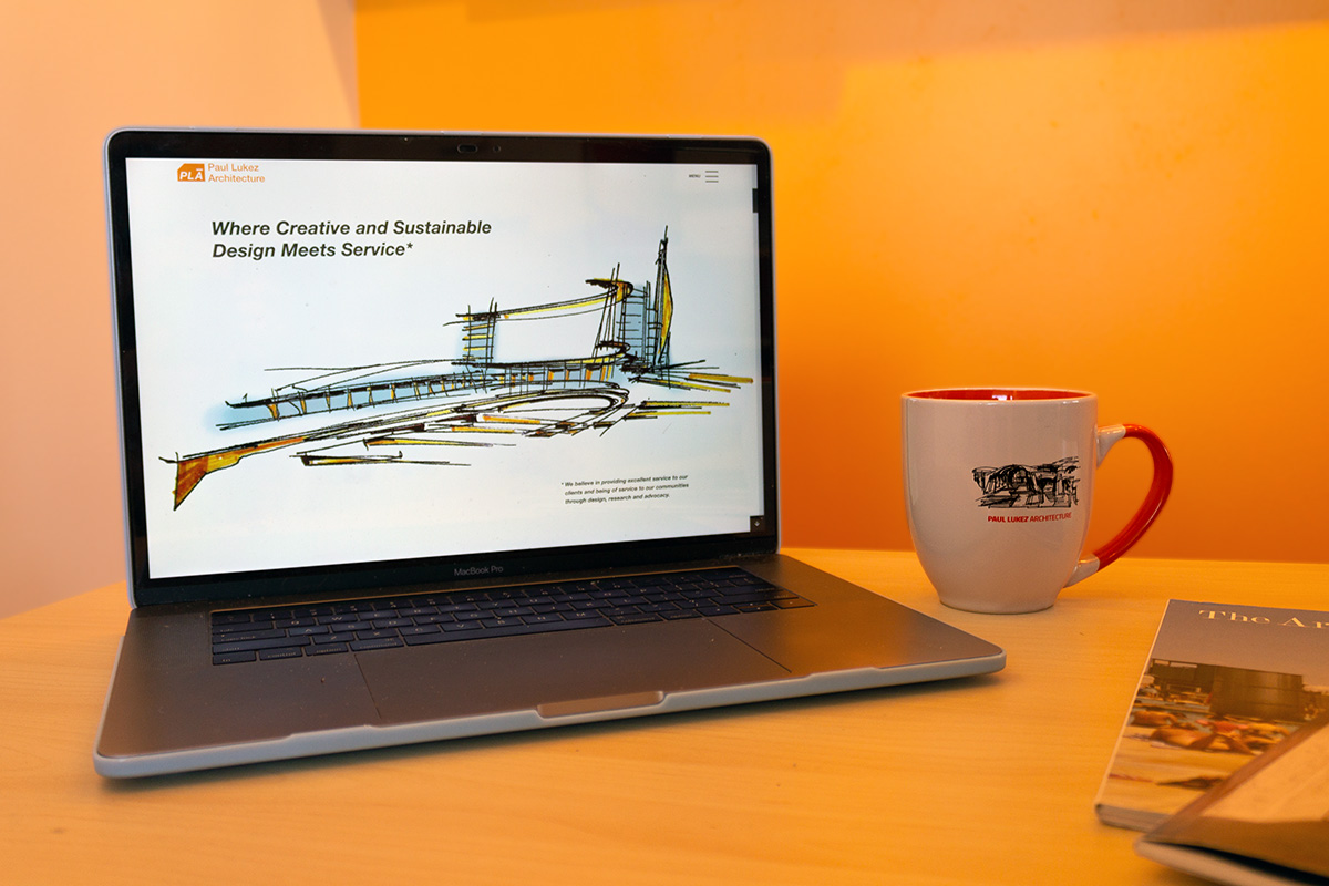
A few weeks ago, Paul Lukez Architecture (PLA) released our new website, which showcases over 80+ projects and many other fun features. The new site is more than just a portfolio website; it’s now a resource hub for all our projects to live and breathe. It’s built for our clients, staff, partners, prospective clients, and the general public. Check it out here: www.lukez.com.
But it doesn’t stop there! In the next two weeks, we are releasing the website for our daughter studio, PLASES, a hub for 30+ sustainable projects PLA has designed over the past 20 years. You will be able to check that site out here later this month: www.lukez-plases.com.
Our website rebranding process has been almost a year in the making, and we learned a lot from that experience. Below are the essential steps we took while making our newly branded websites:
Step 1: Assemble the Key People
Teamwork is necessary if you want to get anything done on time. In architecture, it’s everything. Architecture has so many moving parts it’s impossible to build, design, and develop a structure all alone. It’s true; you seriously cannot do it alone. That same mantra applies to designing a website; you need designers, a manager, copy editors, and most of all, a web developer!
Luckily, we put together an all-star team. Our branding guru, Ben Shapiro, kicked off this entire branding process back in 2019 by leading brainstorming sessions that honed in on what we wanted out of an image refresh and establishing standard terminology to discuss and describe our bodies of work. We hired the fantastic, talented web designer Paul Voulgaris from 67a2 Media to develop these two websites. We used our in-house graphic designer and marketing coordinator, Harper Smith (that’s me), to create new branding identities not just for PLA but PLASES as well. We asked our long-time, incredibly skilled copy editor, Todd Larson, to help edit over a hundred pages of content that our principal and owner, Paul Lukez.

Aside from defining roles, everyone needs to have the same goal in mind. Goals can range from “We are going to create the best website EVER!!!” to “We’d love to communicate our strong mission and vision to new or existing consumers.” See, there’s a range.
Step 2: Develop an Identity
We decided to create a new brand identity and a new website, TWICE! We started by getting at the core of our business – our mission. PLA is a full-service architectural design firm where creative and sustainable design meets service.
Suppose you’re reading our mission statement on the website’s home page and enjoying the sound of it; keep in mind that developing that mission statement took several months to nail down. We played with the words, their different combinations, tone, and overall structure. All this fuss over a sentence is hard to imagine for ambitious and fast-moving junior designers like yourself, but get used to it!
When it comes to developing a brand identity, it’s not always about how good the logo looks or how creative the concept is. At its core, a brand identity is how a company sees itself and how you want others to see it. Does the mission align with the message projected to your audience? Speaking logos, check the new version out below!

Step 3: Make and Create
You’ve got an identity, which means you’ve set the tone for the brand. Use this tone to shape your choice of content. Think about what goes into a website; you’ve got images, videos, data, diagrams, sketches, and most importantly, words. After identifying your brand, you can generate and compile content that makes sense for your brand, which will give you a stronger feeling of consistency throughout the branding and the website.
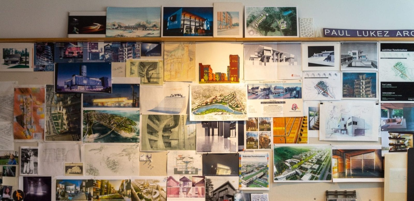
Content is everything, and it will differ from one firm to another. Some sites let their work speak for itself. Other sites have a healthy mixture of visual and written content. Some post content daily, building up a library of resources. To that end, we think you’ll love our website’s “Drafting Table” section; you can see sketches, diagrams, and various art pieces of different mediums, spanning the last 20 years.
Words and text are key; provide as much or as little as fits your website’s goals. Our principal, Paul Lukez, spent weeks rewriting the new site’s content so that all of it was compatible in voice, vibe, and length. Listening to a mix of JS Bach and Miles Davis, Paul sat down to write 100+ pages of content for the site. This project kickstarted our content gathering process for images and graphics.
Step 4: Engage! Engage! Engage!
When it comes to developing a website or designing a fresh brand identity, you always want to be engaged. Creativity and engagement are intertwined but forcing creativity can often stifle it. Some of the best ideas can pop into your head when you aren’t even focusing on the problem. If you are open to engaging in the process, these thoughts can occupy your consciousness and trigger your unconscious, resulting in ingenious ideas. Sometimes they come on the weekend or in the middle of the night; either way, capture those ideas and write them down; you may want to use them later. Even if you think ahead and see how ridiculous these ideas could look – follow the old saying – all ideas are good ideas. Once you’ve got your ideas, share them with confidence, even if they don’t make the cut. Remember, sifting through all your thoughts and picking the best ones will always make your end-product better.
Side note: I cannot stress this enough – accept criticism and engage in the critiquing process, actively seeking feedback and critique. Many people take critique personally, which is rarely the critic’s intention. The critique process can advance and push our minds in surprising new ways, as long as you are open to listening to your team and adapting your design from there. If you assemble those key people mentioned above, then you’ll have an all-star team of doers, listeners, and creatives who are all invested in the same end goal.
Step 5: Set a “deadline”
Every project should consider timeframes and deadlines. Some projects are deadline-driven; others are more content and goal-driven. Your team has to make lots of decisions throughout the design process, and this is a big one. How important is meeting a fast-paced deadline versus using the design process and an opportunity to generate new and essential ideas for the company’s future?
Our point is this – every creative project needs an adequate gestation period. Decide how much time you want to allow yourself in this endeavor. Are you going to crank on this project to meet a tight deadline, or are you going to allow yourself a more comfortable schedule where ideas can flourish? It’s crucial to recognize the milestones that you will need to meet in creating a new website and branding in both cases. Lay those out and give yourself as much time as you think you need and as much as you can afford.
We had a different goal with this deadline – it was milestone-driven. We wanted to make a beautiful website that wowed our audience. Crafting the right mission statement was critical to our rebranding process, and this can take time. Allow this to happen. Give yourself the luxury to take a step back and try again until it’s just right.
Step 6: Get to work
I’ll end with the most critical step of all; you’ve got to get to work. When we started this project, we knew it would be extensive. Prepare yourself for long nights, multiple iterations, differences in opinions, and plenty of inside jokes among your team. You’re in it for the long haul now, and from all of us at Paul Lukez Architecture, we wish you the best of luck!
Feel free to reach out to Harper Smith (me) if you have any questions or are looking for additional resources. Email: hsmith@lukez.com

