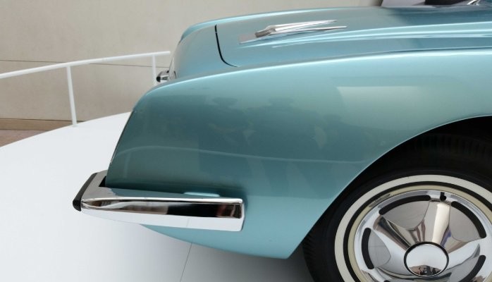
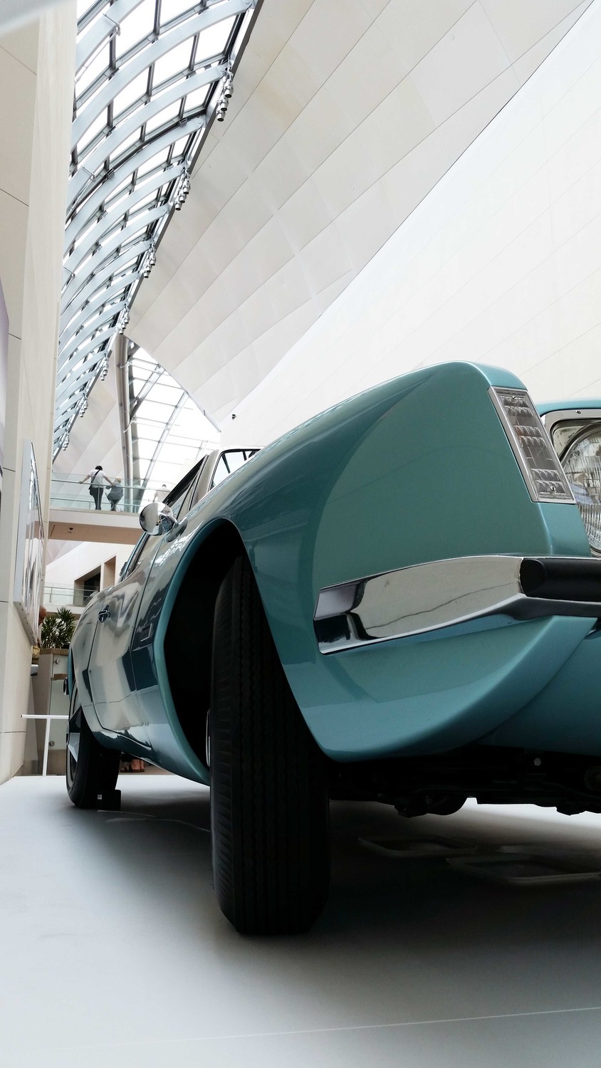
What defines timeless design? I asked this question upon noticing a metallic turquoise-colored car in Moshe Safdie’s atrium at the Peabody Essex Museum in Salem, MA. Eclipsing “your father’s Oldsmobile,” this objet-d’art was the 1963 Studebaker Avanti designed by famed industrial designer Raymond Loewy. How could a car created some fifty years ago still look so good, so contemporary? What made Loewy’s masterpiece able to transcend fashion and time?
These are questions that I, and many of my colleagues, ask ourselves as we create designs for new buildings and cities. How can we design spaces and places that will look good and feel right for decades to come? How can we build structures and forms that are of their time—created with contemporary materials and processes—but do not appear “dated” amid the next fashion wave?
Here are some of the factors that I think contribute to creating “timeless design.”
Style vs. Sense of Style: What struck me most about the Studebaker were its graceful lines and curves—so fitting for the atrium’s curvilinear roof structure. The car’s envelope helps us read the form and shape of a given mass. Great clothing designers are masters at this, allowing the human body to be viewed differently, depending on the type and cut of fabrics cloaking it. Indeed, how to define the enveloping form, what materials to use, and how to mold it becomes a three-dimensional challenge for all designers. Drawing that perfect curve that defines the car’s profile in three dimensions requires extraordinary skill, talent, and a refined eye. Loewy’s understanding of this comes out in his car.
Scale and Proportion: Scale and proportion are essential to great design. Proportion implies a dimensional relationship between two or more things in space—a house and its roof, a tie, and suit jacket, etc. We have an intuitive sense when scale and proportion are off, like when a structural beam is too big for its span, or a tie too thin for a suit. Loewy found the sweet spot in shaping an appropriately scaled and elegantly proportioned volume made up of its many components—hood, carriage, windshield, doors, trunk, etc. Each component is sculpted to the “right-size” (courtesy of my former teacher, Aldo Van Eyck), and all are perfectly sized, configured, combined, and calibrated to each other, visually and functionally. The net effect is pleasing to our minds and senses. Moving one component, or re-sizing it, could destroy the composition.
Craft and Detail: To create designs that are timeless, we must also consider each material’s characteristics and how it is assembled and crafted. For instance, a material’s performance attributes vary greatly: clay is malleable, where glass is brittle; steel is strong, and wood will splinter when overstressed. Understanding each material’s characteristic properties and limits allow the designer to select the appropriate material palette for a composition. Different material elements are brought together in a way that works within the limits of each substance, pushing its performance where possible and appropriate.
This is where craft and detail come into play. Each material and how it meets another must be integrated with great care. There is an art to how materials of (dis)similar types are joined to one another. Working with the language of joinery, stretching it—or even breaking the rules—is something that can communicate a designer’s intent as well as spirit.
Loewy achieved this with the Avanti. Its rear glass window’s sweep around the passenger cabin’s curve is sublime, as in the way the chrome frame minimally anchors the glass to the car’s sheet-steel body. He understood both the limits and the potential of glass’s pliability in connecting it to a larger assembly.
This was years ahead of the sleek designs first produced by automakers in the late ’90s. Audi was one of the first car manufacturers to seemingly shrink-wrap the body so the glass and steel unified in apparently continuous surfaces. By being ahead of the curve of time and design advances, Loewy’s 1963 Studebaker Avanti is more resilient to the vagaries of taste and fashion.
Final Comments: So on your daily encounter with the hundreds and thousands of objects and spaces that shape your daily experiences, ask yourself which object or space would you like to have around you in years to come. Which will still be worthy of your attention and use? Which captures the spirit of a time and place? Which will contribute to a sustainable future for future generations?
Please share your thoughts on this with Paul Lukez FAIA at plukez@lukez.com
Paul is an architect and author, whose award-winning firm Paul Lukez Architecture creatively designs sustainable and poetic places for people. (www.lukez.com)


