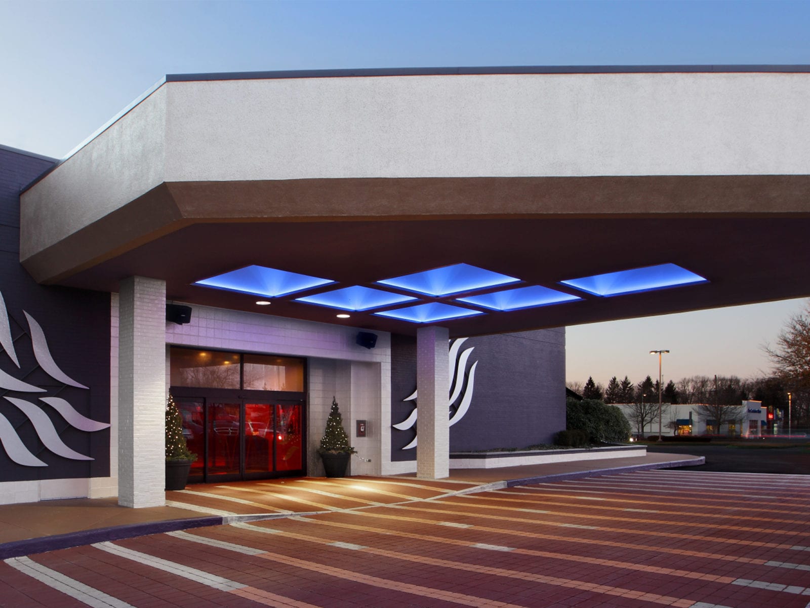
Synopsis: The owners of an established chain hotel in Boston’s bustling western fringe wanted to revivify the 30-year-old structure with fresh, vibrant amenities as a refined hospitality setting within the city’s changing suburban context. The updated ambiance appeals to business travelers visiting companies along Boston’s Route 128 technology corridor, as well as locals, with the sophisticated urbanity of upscale city accommodations.
Detailed Description: For business travelers and locals tired of predictable environments featured by brand-name American hotels, the Verve offered a different hospitality experience in suburban Boston. This experience was achieved in part through a unique palette of materials, colors, and textures triggering associations with food, music, art, and cultural icons during the visitor’s formative postwar years.
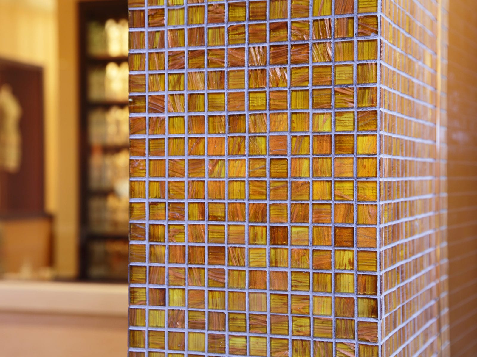
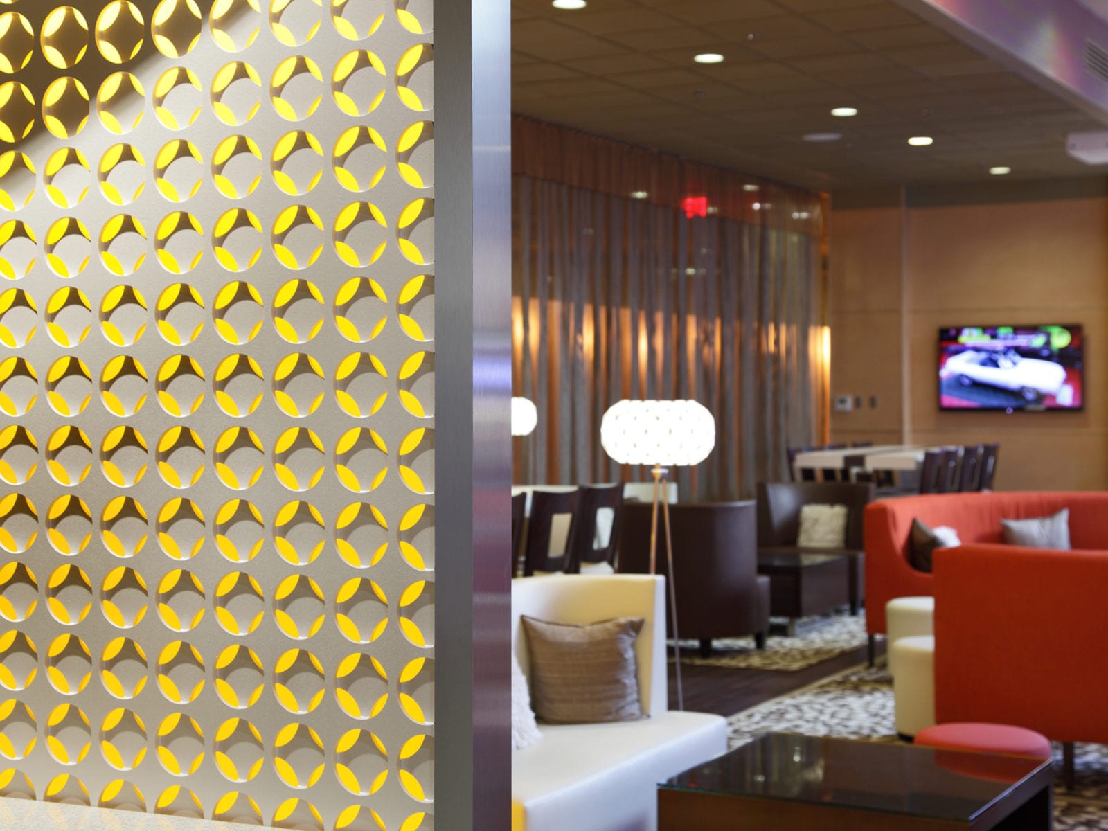
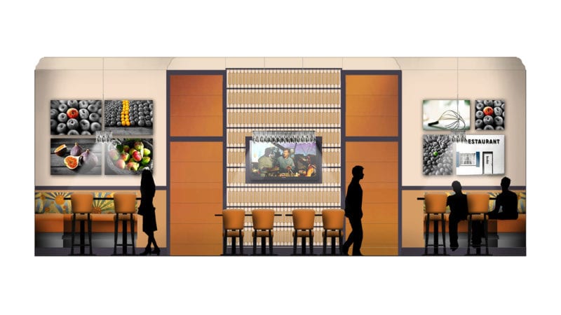
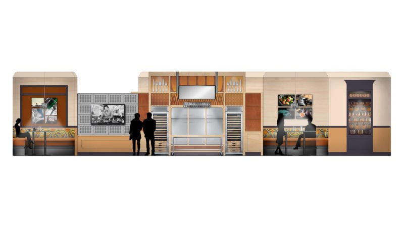
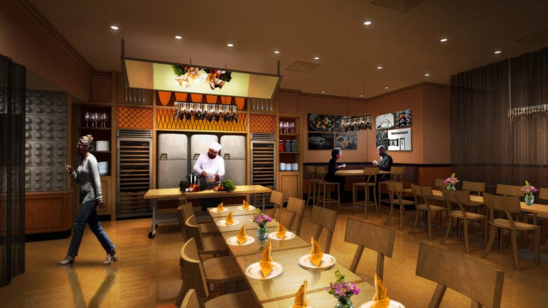
For instance, spaces were defined in part by recycled materials, equipment, artwork, and imagery representing 20th-century America. Reused milk bottles, refurbished refrigerator doors, and rolling pins defined and cladded the spaces of the Pantry, the hotel’s main restaurant. In contrast, the lobby spaces transformed recycled plastics and plywood into screens and surface material through diverse CNC cut patterns. This collage of past and present materials was held together by the reorganization of public spaces.
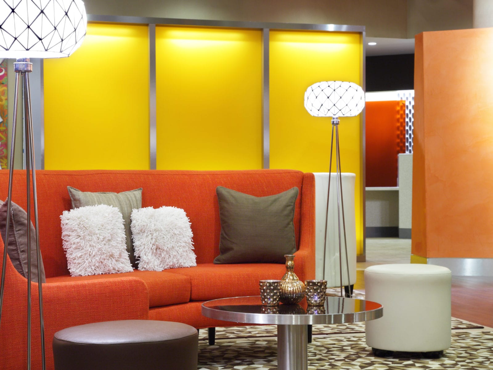
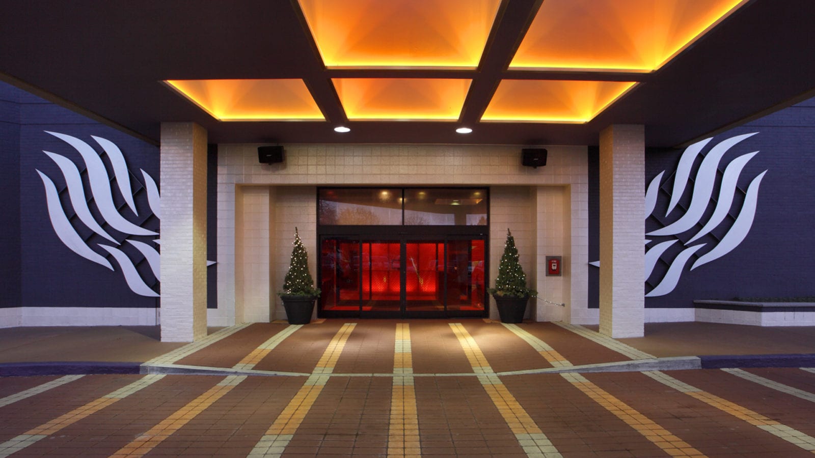
The hotel’s original plan was in keeping with the 1980s design standards, relying heavily on rotating geometries. Rooms and spaces were rotated 45 degrees relative to each other, often creating awkwardly shaped public spaces. Navigating through this web of corridors and lobbies was confusing at best. In response, we created a spatial diagram of the hotel’s public spaces to organize the ground floor. All extraneously angled or rotated areas were eliminated where possible. Spaces were squared off and arranged in relationship to a new major axis connecting the entrance vestibule and Pantry restaurant. A unique curved orange wall embraced the newly created spaces while directing visitors to the reception desk, elevator, and ballrooms.
Simply by removing a few existing walls, platforms, and ceilings and adding new, strategically located walls, the entire volume of space is experienced in a more dramatic yet precise manner.

